This Galaxy Z Fold 7 blunder reminds me how the iPhone 16 got things really wrong
Particular smartphone details can be of significant value, though: so even if I’m being extra pixel-peeping here, some of you might agree with me on what I’m about to say.
The Galaxy Z Fold 7 is a glorious (design-wise) device – it’s the thinnest, sleekest foldable by Samsung so far. In fact, it’s as thin (8.9 mm when folded and 4.2 mm when unfolded) as the Oppo Find N5, and that’s quite the achievement. The thinnest foldable right now is the Honor Magic V5 at 8.8 mm, but the 0.1 mm difference is more of a show-off move than something that’s going to be felt in real life usage.
Of course, the phone isn’t perfect. It has its fair share of shortcomings, mainly on the battery and charging speeds fronts, as I’ve explained here:
Now, it’s time to discuss what else is wrong with the brand-new Z Fold 7 – or, to put it more gently – what could’ve been better.Amidst its glorious exteriors, there’s a hiccup that I’ll never be able to unsee. It’s like that little scratch on the roof of your mouth “that would heal if only you could stop tonguing it, but you can’t”, as the Narrator in Fight Club said – and I can’t stop tonguing it.
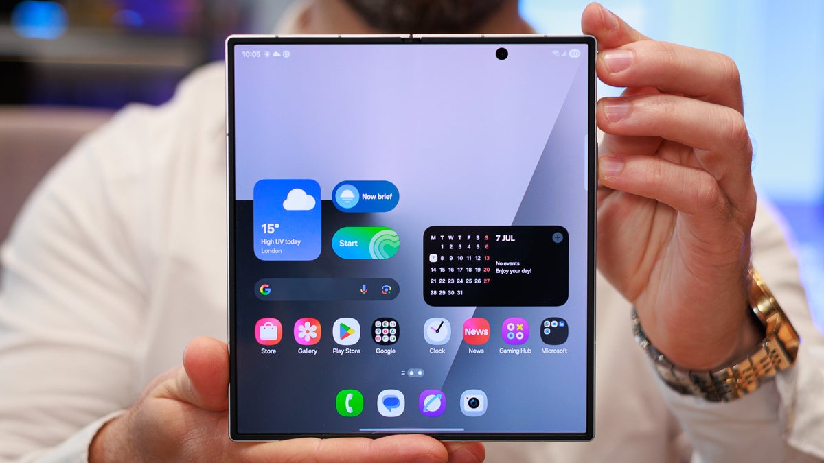
I’m talking about the selfie camera on the inner display and its placement – it’s right in the middle of… the right part of the screen.
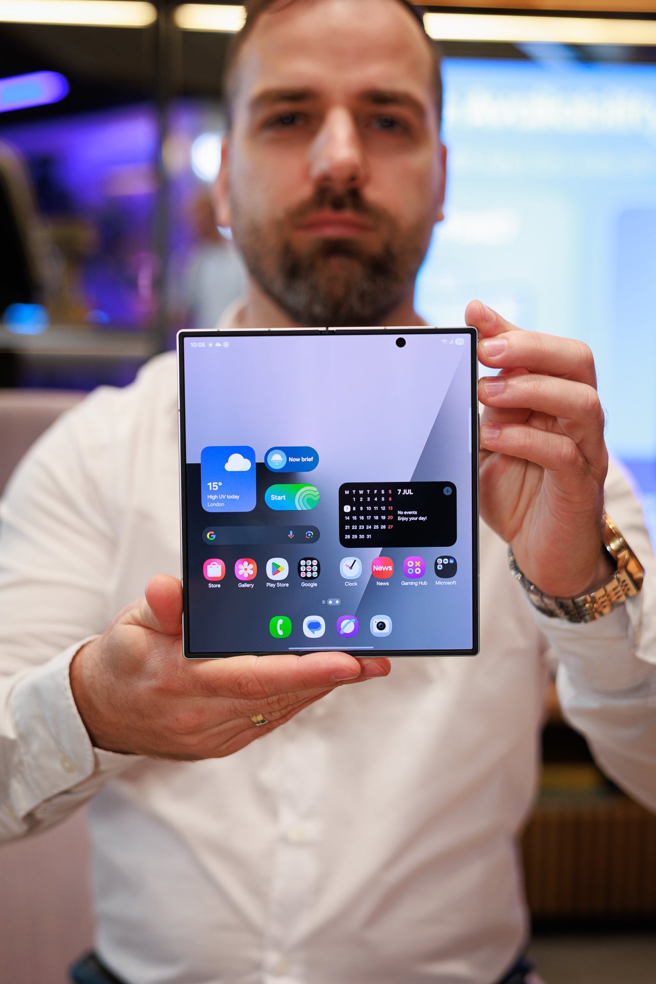
Image by PhoneArena
Many of you will probably ignore it and will just go on with your lives. But I wish this hole-punch camera was positioned in the upper right corner.
Why? Well, because, if the inner selfie snapper is in the upper right corner, this glorious screen (and it is definitely one glorious panel) will look better. Right now, it screws up my symmetry Feng Shui OCD. Technically, it’s in the middle of the right part of the screen, but the inner screen unfolds to a large rectangular canvas. There’s a dot that’s 25% to the right of the true center… and it shouldn’t be there.
Of course, this isn’t something that’ll keep me up at night – it’s just a minor misstep that won’t hurt your day-to-day experience. That being said, pictures and videos would certainly look better without that black circle intruding like that.
Funny enough, this hiccup made me recall the time the iPhone 16 series – yes, even the iPhone 16 Pro Max variant – got things wrong design-wise.
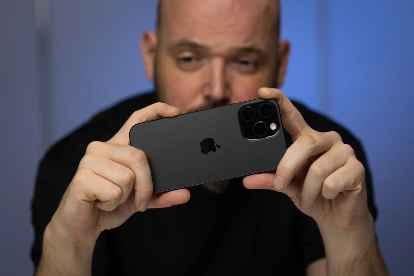
Image by PhoneArena
It’s the Camera Control Button that was introduced with the iPhone 16 that was misplaced as well.
Generally speaking, I like the idea of the Camera Control Button, but it’s put at a very inconvenient place, as my colleague Preslav observed:
Why is the Camera Control button so far into the frame? This is already an awkward positioning for the regular-sized iPhone 16, it is a bit too out-of-reach for an iPhone 16 Plus or iPhone 16 Pro Max. You need to grip the phone a bit more awkwardly, because if you cup the bottom, your hand will make full contact with the frame and block the microphone there. And, it doesn’t feel nice to slide over the button with your finger already stretched out.
Yup, it’s hard to believe that the Cupertino team overlooked it, so maybe they’ll fix things with the iPhone 17. Or the iPhone 18?
