One UI 8 fixes my biggest issue with app lists on the Galaxy Watch

Ryan Haines / Android Authority
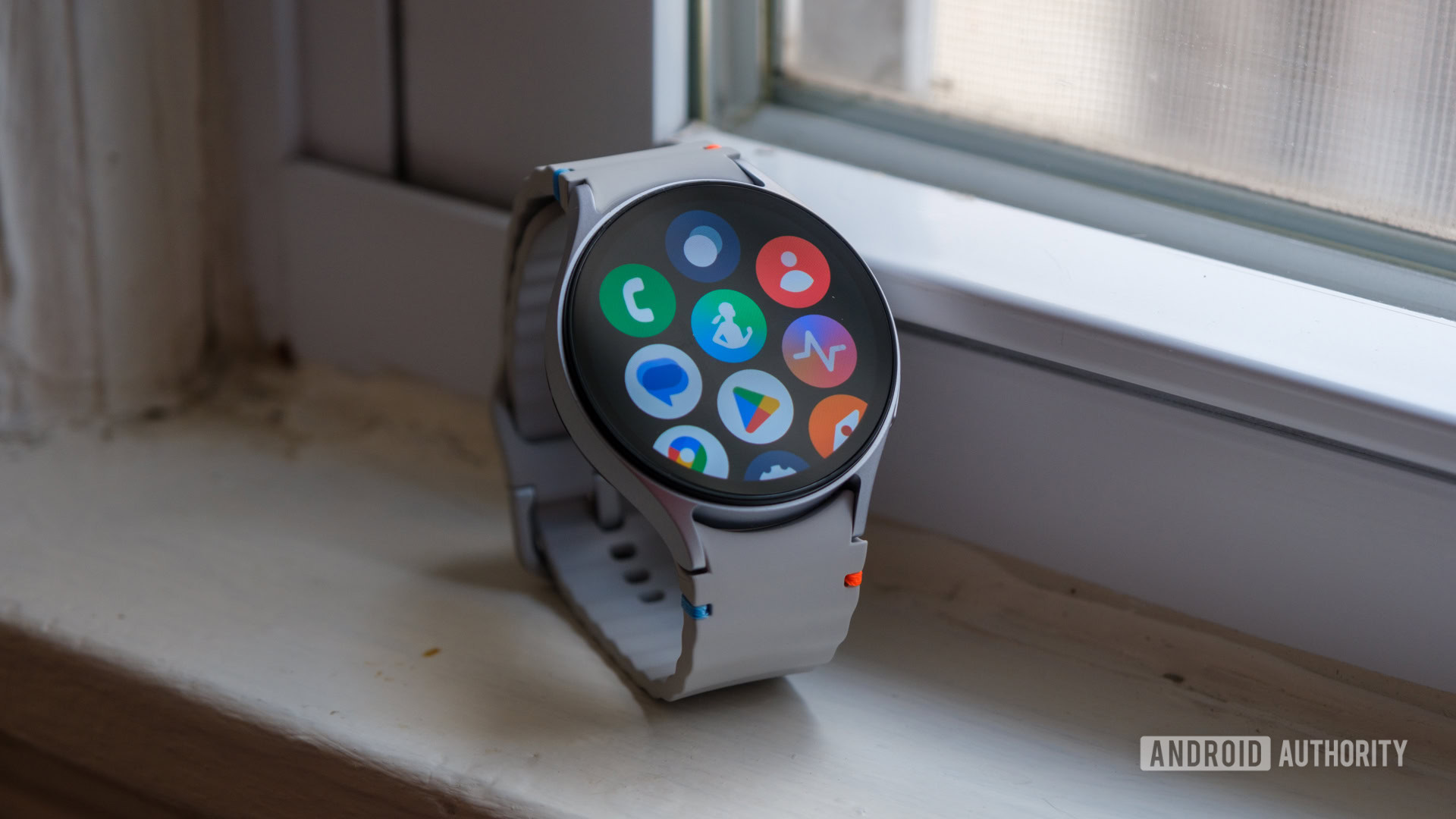
Samsung’s One UI 8 Watch isn’t trying to reinvent one of my favorite smartwatches; it’s just making it easier to use. Currently in beta for the Galaxy Watch 7 and Galaxy Watch Ultra, the new platform streamlines the user experience with a handful of thoughtful interface upgrades, including a small but impactful change to the app drawer.
Anyone who takes full advantage of the Google Play Store knows a smartwatch app library can quickly turn into a crowded room. Endlessly scrolling past apps you rarely touch just to find the one you used an hour ago becomes frustrating quickly. Enter Samsung’s new Personalized apps screen. Instead of a static list, the app drawer now dynamically surfaces your most-used apps, keeping them front and center. It’s a subtle shift that could dramatically reduce the time spent hunting through icons.
The Personalized apps screen brings my most-used tools to the top to save me time and tedious effort.
For users like me who have an app library that’s more like an archive, this is a game-changer. There are certain apps I use every single day, like workouts, messaging, and music controls. But I also have plenty of tools I rarely use, a few I keep “just in case,” and entire folders of travel or activity-specific apps that only matter in the right context, like snorkeling in various tides or navigating unfamiliar airports. Then there are the fitness, productivity, and mindfulness apps I tell myself I’ll get back to (eventually), and essentials like the flashlight or timer that I only need on occasion but never want to uninstall. In short, I’m exactly the kind of user this redesign was made for and the kind who greatly benefits from having the most relevant apps automatically brought to the top.
Kaitlyn Cimino / Android Authority
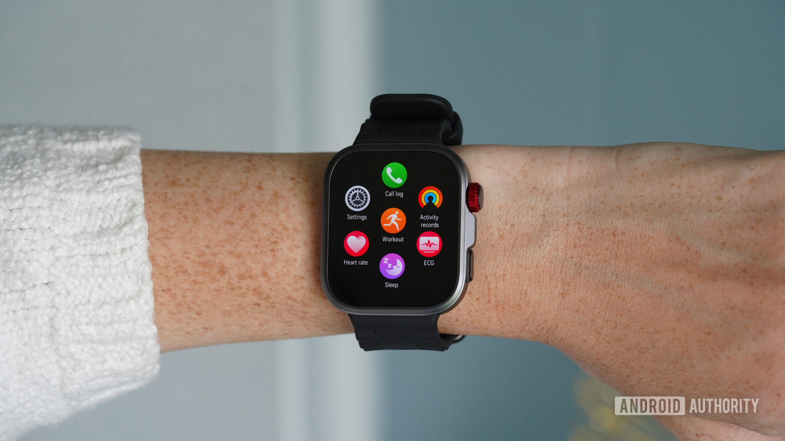
Another small but smart improvement is the option to switch the app drawer from a grid of image-only icons to a view that includes text labels. The default still exists, but the option to add app names offers more clarity for anyone with a less-than-perfect memory for icon designs. Earlier this year, I noted the same feature while reviewing Huawei’s Fit 4 Pro. On that device, app icons shrink to reveal titles when you turn the digital crown, a minor detail, but a hugely helpful one, especially when digging into an unfamiliar ecosystem.
Samsung’s implementation follows the same line of thinking. It’s about making the interface easier to read, quicker to navigate, and less reliant on visual recall. Again, if you aren’t someone who stocks up on third-party apps, it might not be a relevant update. If, like me, you have a wide range of burnt orange icons that all look the same, or you struggle to differentiate between the shape of a stopwatch and an alarm clock, it’s a great addition.
Each of the One UI 8 Watch user interface refinements works to reduce friction.
App drawer updates aren’t the only refinements in One UI 8 Watch. Samsung is also delivering a wrist-based Now Bar for glanceable info without leaving the watch face, as well as more flexibility in terms of Tile customization. This includes the new option to stack two tiles on a single screen for quicker access to key features (and less excessive scrolling). Meanwhile, gesture support is also getting a quiet but meaningful upgrade. Across all of these changes, the focus is clear: reduce friction.
One UI 8 Watch isn’t about bold redesigns, it’s about thoughtful polish that makes the smartwatch experience faster, more fluid, and easier to live with. These aren’t headline-grabbing changes (well, besides maybe this headline), but they’re the kind that stick. Personally, I’ve been sold on Samsung since the launch of the Galaxy Watch 4 series, and I’m stoked to see the brand continue to deliver.
