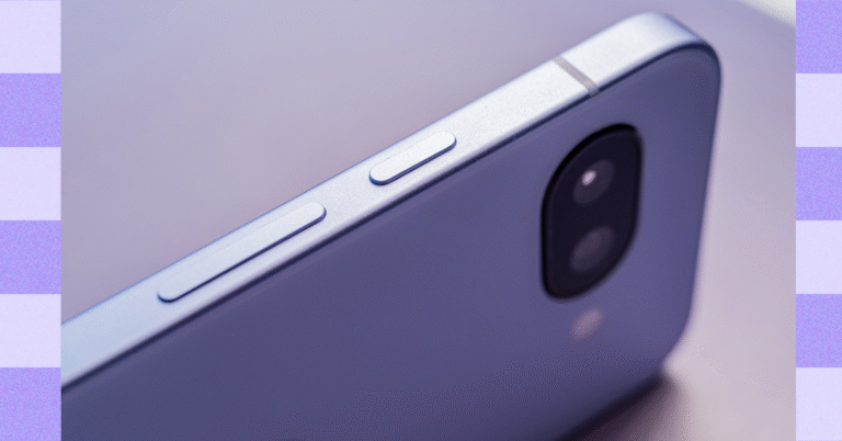
iPhone 17 Pro’s leaked renders show another significant design change
The famous Chinese leaker Majin Bu shared an alleged render of the iPhone 17 Pro, and in that picture the design change is obvious. The MagSafe design is different, and the Apple logo is positioned lower.
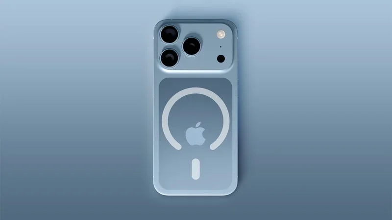
The current design of the MagSafe magnets features a complete circle above the vertical dash line, but the new one has an opening, most likely to allow for the new placement of the Apple logo.
According to Majin Bu, the change in the position is necessitated by the iPhone 17‘s big camera housing. Moving the logo down will allow it to be perfectly visible when a MagSafe case is on. Had the logo remained at its previous place, it would’ve been partially covered by the MagSafe cases.
Will older MagSafe accessories be compatible with the iPhone 17?
The answer is yes! Sources from the manufacturing field told Majin Bu that the new design will be perfectly compatible with old MagSafe accessories, and the change will be only aesthetic.
Another rumor, however, talks about faster charging speeds with the new MagSafe on the iPhone 17, but apparently this is not due to any changes in the design itself and has something to do with the MagSafe charger.
Our take
Beauty is in the eye of the beholder, and it’s hard to judge aesthetic changes. It seems that the new camera bump, which by itself is quite controversial visually, creates a ripple effect in the iPhone 17 design as a whole.We need to hold the iPhone 17 in our hands and also put a MagSafe case on it to be able to evaluate the design, and even then, it might not be a clear-cut decision.
What we can say is that the iPhone 17 looks radically different than the iPhones of late, and we haven’t seen a major design change since the iPhone 11 days.
At first glance the offset logo and the incomplete MagSafe ring look a bit strange, but maybe it will grow on us.
What do you think about the new MagSafe design?
The old MagSafe design and logo placement | Image by Apple
Time to get the vox populi and see what the community thinks about the new design. On the one hand, it kind of looks like the logo is in the wrong spot (but if you trace the diagonal lines from the corners on the back, it sits in the center). On the other hand, the open MagSafe ring creates a visual impression that the logo is offset and misaligned.
What do you think about it? Do you like the change, or do you prefer the older design? Vote in the poll and share your thoughts about the iPhone 17 design in the comment section below.
Read More: