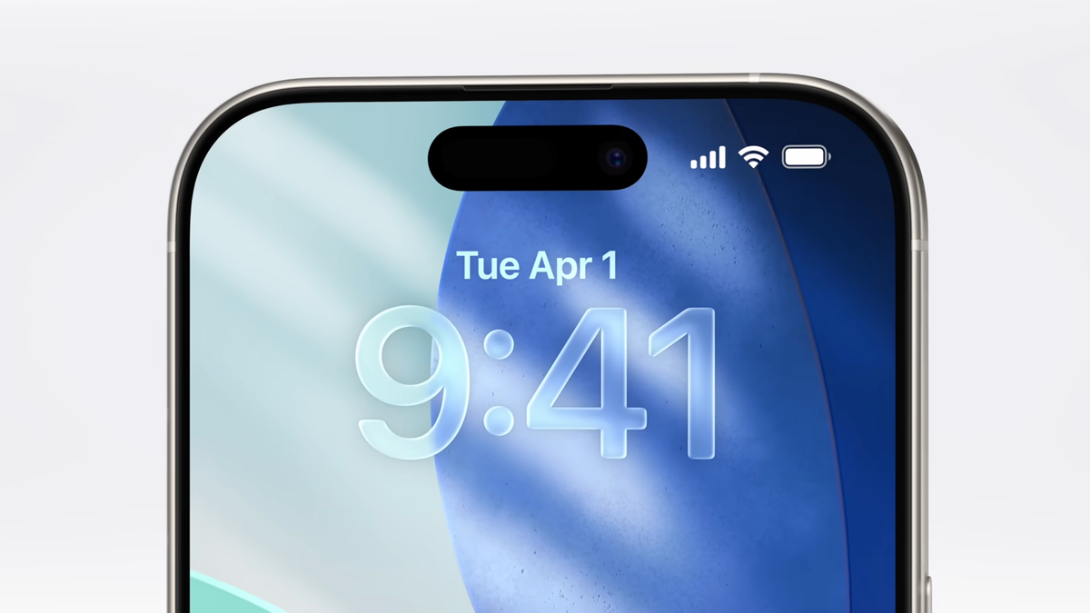
iOS 26’s Liquid Glass might make your iPhone look less like a patchwork of apps
. The Cupertino giant introduced something called Liquid Glass – a fresh design overhaul focused on making your experience smoother, more fluid and way more intuitive.

During WWDC 2025, Apple introduced Liquid Glass. | Video credit – Apple
Liquid Glass is all about putting the spotlight on your content while giving the whole interface a personalized, dynamic vibe. Imagine it as a special material that blends the look of glass with a flowing, almost liquid feel.
When an element floats over text, its shadow automatically darkens to help it pop and stay easy to see. | Image credit – Apple
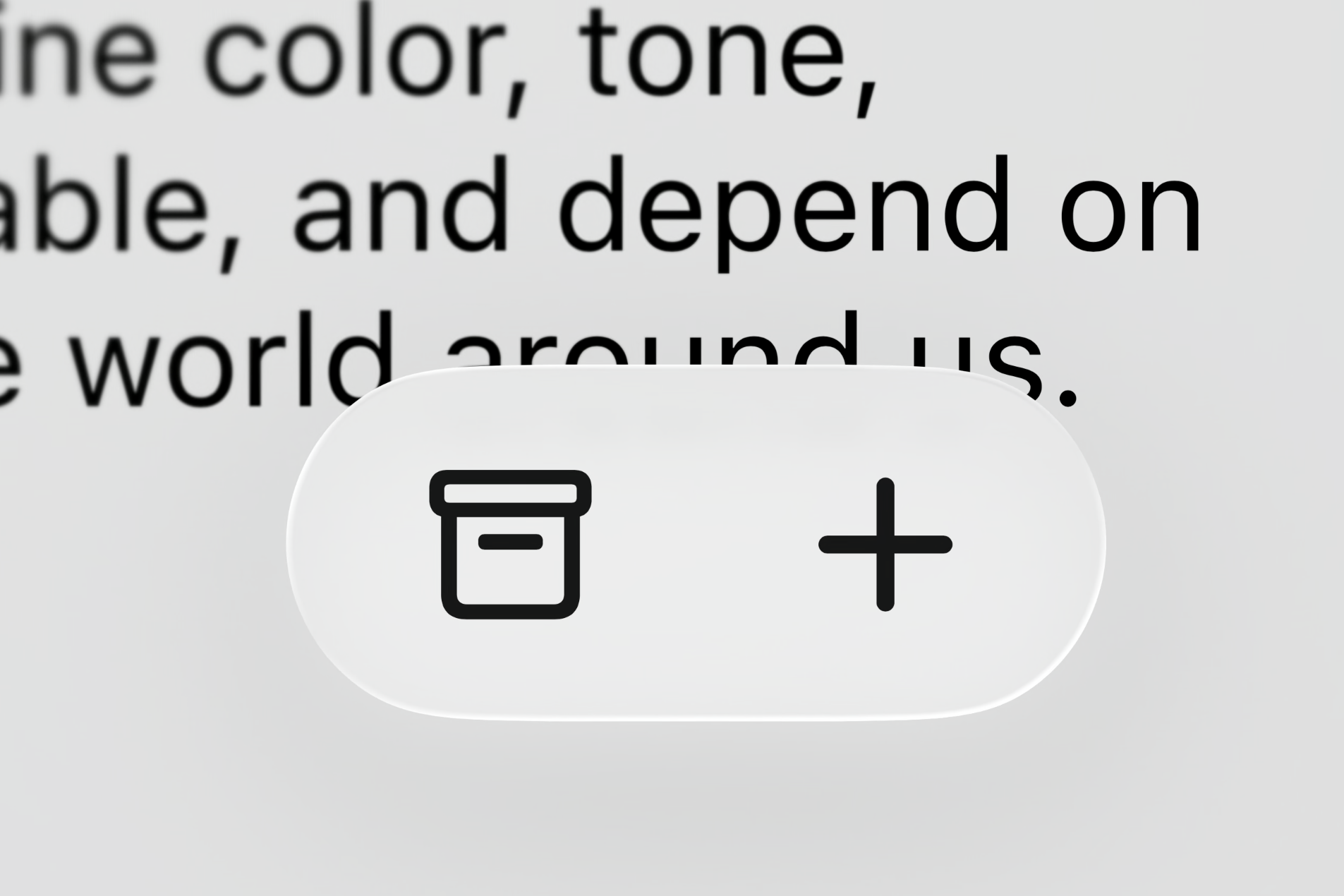
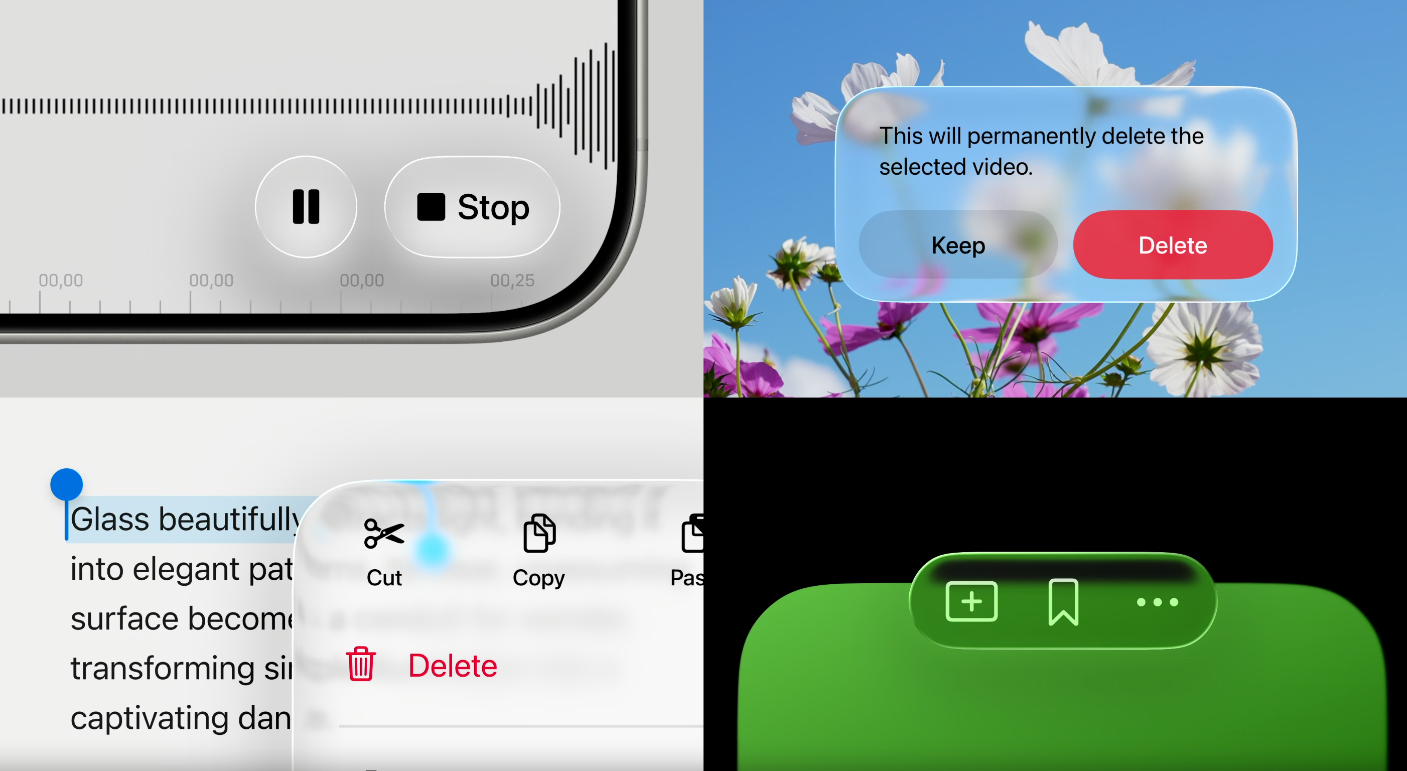
Shadows play a key role, too. For example, when something floats over text, its shadow gets darker, making sure it stands out. But when it is over a light, solid background, the shadow gets lighter to keep things balanced. This subtle but smart behavior helps elements pop without feeling like they are cluttering the screen.
Here’s how a solid-colored icon looks next to one using the new Liquid Glass style. | Image credit – Apple
All of this makes the whole interface feel more dynamic and alive. And the coolest part? Developers don’t have to manually program these effects. Liquid Glass comes with these detailed, responsive behaviors built in, so when it is applied to an app’s design, it should just work.
Overall, the new design is way more transparent. | Image credit – Apple
Here’s a glimpse at how navigation bars in many apps could look once they switch over to Liquid Glass. | Image credit – Apple
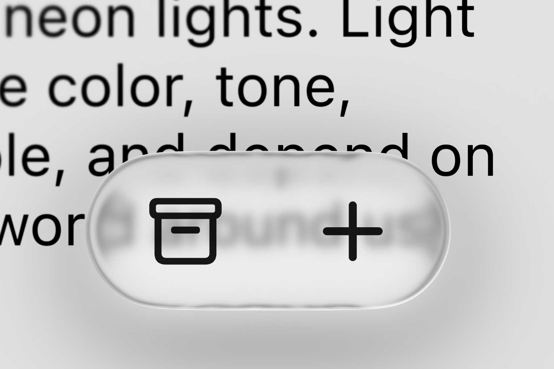
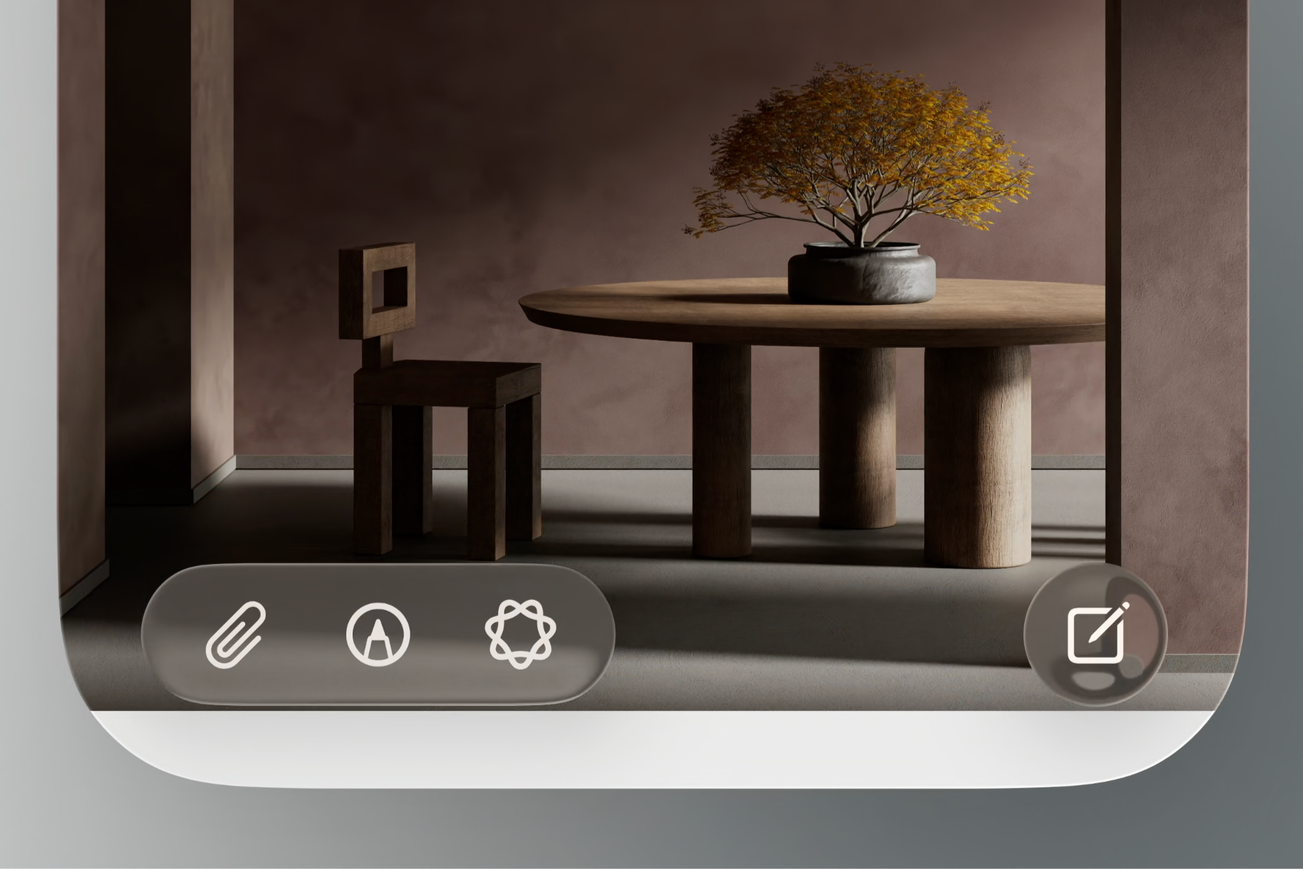
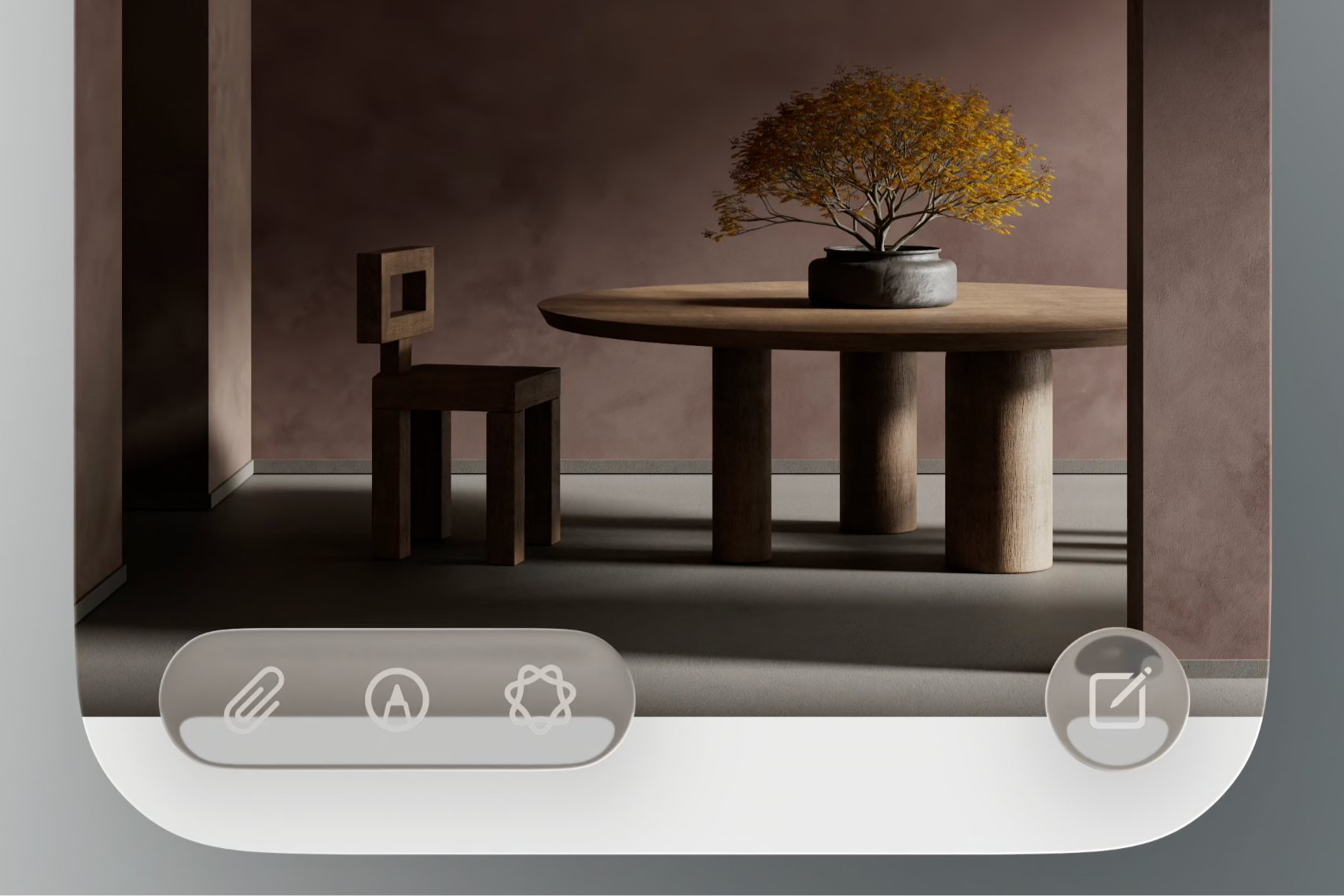
The Clear version stays see-through all the time. | Image credit – Apple
Colors are also handled smartly. Liquid Glass elements can adjust their hue, brightness and saturation depending on what is behind them, matching the content’s tone without losing their own identity. Apple took inspiration from how colored glass works in real life, subtly changing appearance based on the background.
Expect to see similar elements show up in third-party apps, too. | Image credit – Apple
Think about navigation bars, menus, even keyboard backgrounds that gently reveal what is behind them. Your banking app, social media apps and games won’t look exactly the same, but they will start sharing a consistent visual language – similar translucent materials, smooth animations and responsive controls. It is a fresh way to bring everything together without making it feel cookie-cutter.