iOS 26 is giving me serious Windows Vista vibes

And once you see it, you cannot unsee it.
Here’s another reminder: Windows Vista was released in 2006.
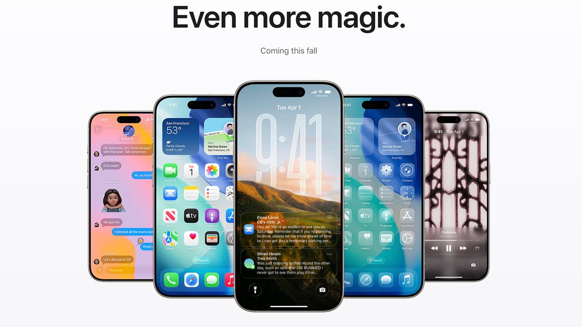
I honestly don’t know how to feel about this. On one hand, this new Liquid Glass design is decidedly cool and… skeuomorphic in its own liquid glassy way, but on the other hand, it looks really, well, very retro.
This retro style is particularly visible when you turn on the all-new Clear Look where all your icons turn transparent in one giant madness of glass-y glass on your home screen.
And this comment about readability and accessibility going down the drain with iOS 26 also rings true.
Aside from the funny part of history repeating itself in curious ways, there is undeniably the cool and “lickable” part of Liquid Glass design that is also undeniably there.
And of course, there are the reminders how all of the Android competition will have this in… two or three years maybe?
Alright, time for your take on iOS 26.
With no major advancements in AI, is this new design the thing that others should envy and copy? Sound off in the comments below.