iOS 26: a closer look at the fresh redesign
But by 2013, Apple ditched that look with iOS 7. That update introduced a flat, minimal aesthetic made for the digital age – no more fake textures or real-world references. It was all about color, transparency and simplicity.
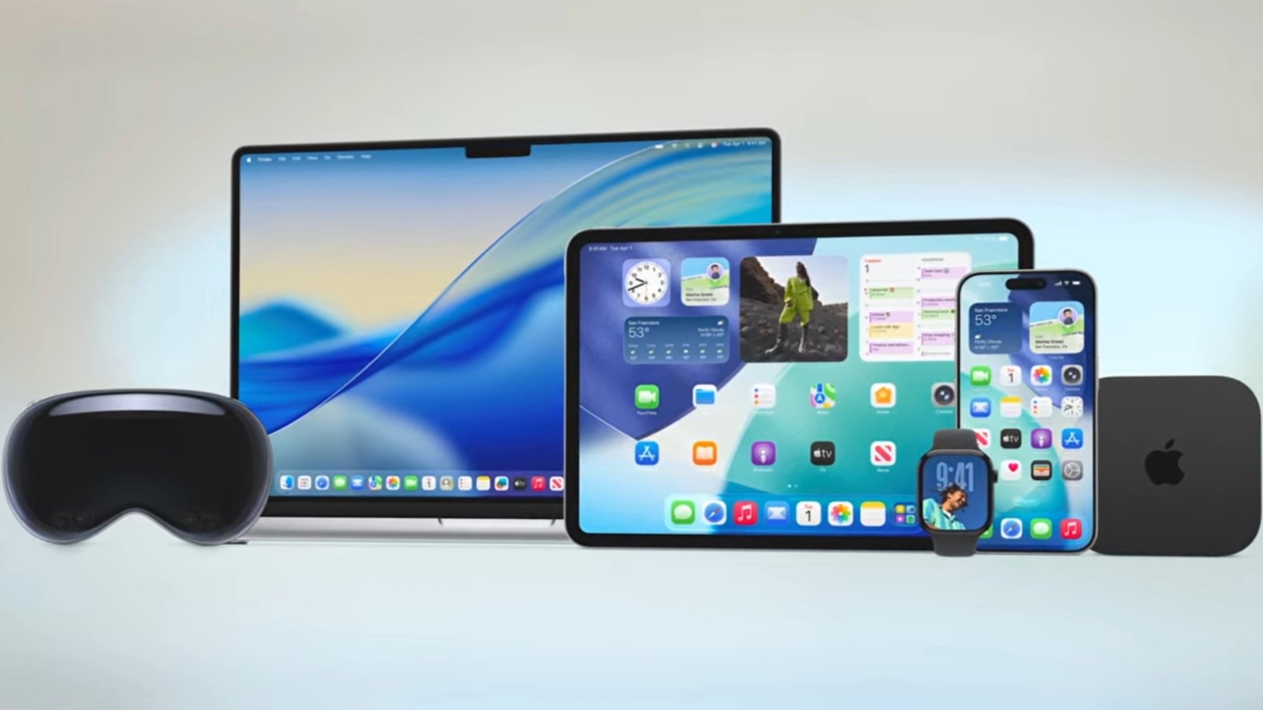
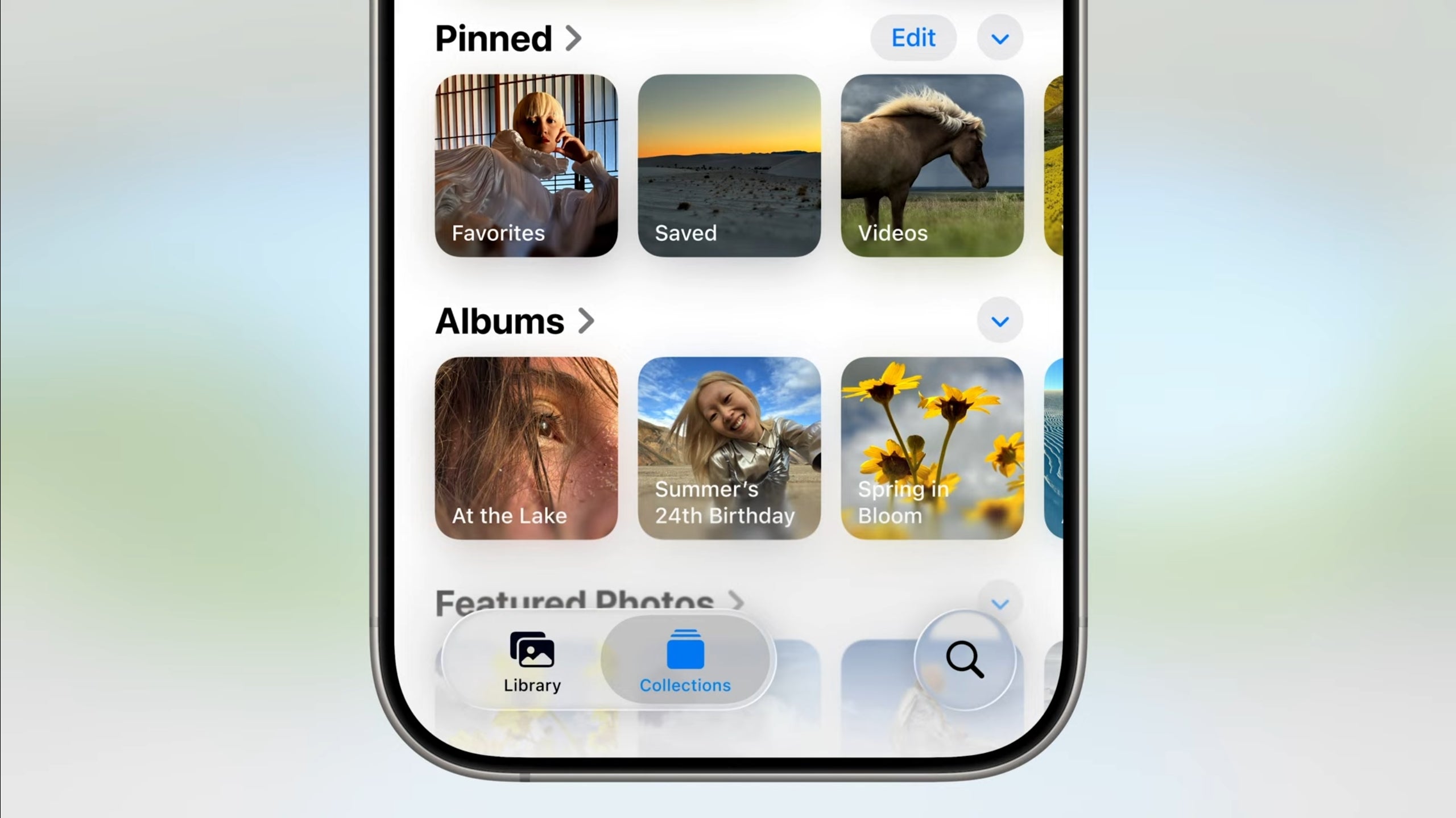
The new design is more transparent. | Image credit – Apple
Here’s what is changing in iOS 26:
- Toolbars, tabs and in-app elements now use light, glass-like transparency.
- App icons and widgets get a fresh redesign to match the new style.
- Safari’s address bar goes translucent.
- The Camera app has also been revamped to align with the glass-inspired look.
- Pop-out menus are now a big focus, making navigation feel more dynamic.
- The new design responds in real time to what you do on your phone.
- It intelligently adapts between dark and light environments.
The Camera app is redesigned with Liquid Glass in mind. | Image credit – Apple
But why is Apple redesigning now?
Just like flat design was rolled out alongside new hardware like the Apple Watch and larger iPhones, the Liquid Glass look is setting the stage for what’s next – and that includes a big 2027 release.
Apple is reportedly working on a major iPhone redesign to celebrate the 20th anniversary of the original model. Internally, it’s being called “Glasswing,” inspired by the butterfly with transparent wings. This future iPhone is expected to go all in on the glass aesthetic, possibly featuring wraparound glass sides, ultra-thin bezels and a display free of notches or cutouts.
So yeah, iOS 26 isn’t just a software refresh – it’s Apple laying the groundwork for the next era of iPhone design.