Clutter be gone: iOS 26 tidies up the photo mess
The change of this key app with iOS 18 made many iPhone users unhappy (understandably). Now, iOS 26‘s version of the Photos app has to try hard enough to please people. The updates this time around are fewer than what one might expect, but still, there is an improvement.
iOS 18 entirely changed the layout of the Photos app. There were no longer multiple tabs of content, and iPhone users were greeted with a single-page design. The Library became a grid in the top half of the screen, and carousels of featured sections were positioned below.
Obviously, tabs would make it easier to go to a specific section, but iOS 18 doomed iPhone users to scroll and try to find themselves in the clutter.
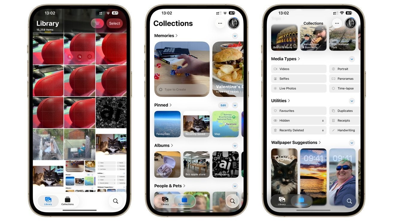
There are tabs! | Image Credit – AppleInsider
When you swipe down, the tab element is hidden, and you get the option to sort by date. You have a button to revert to the main tab as well.
The search icon is now at the bottom right and has become larger.
The changes are not immense, basically, they just separate the Library grid from everything else, but this small tweak is actually making the Photos app much easier to navigate!
Personally, I was one of the people who got quite frustrated with iOS 18‘s Photos app. I still find it frustrating despite using it for quite some time, and I couldn’t be more happy to see Apple bring back some order into the chaos.
Meanwhile, there’s a big update to the Photos app in the face of the Spatial Photos generation feature. Now, the iPhone can convert a 2D image to a 3D version from a small icon in the top-right corner of the Photos app.
This feature can be used for Vision Pro, but is also used in the new Spatial Wallpapers feature that Apple showed during the WWDC 2025 keynote on June 9.