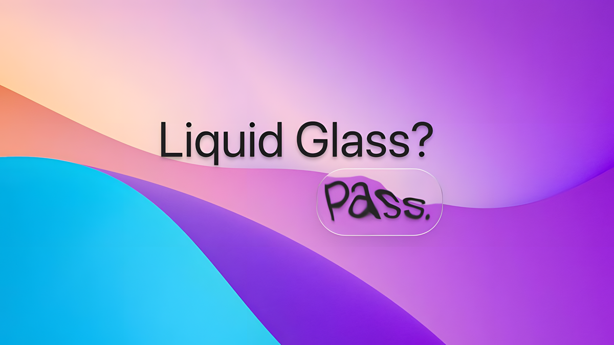
Apple’s Liquid Glass looks bad, but everyone will still copy it
Whenever Apple unveils any new product, it usually gets copied and emulated to oblivion. We’ve seen it time and time again with the company’s phones, tablets, laptops, and watches, but we are most commonly witnessing this in software, where the bar of entry is a bit easier to hop over.
Why? Well, because it’s developed by Apple, and if there’s one thing that we can be certain about Apple’s rivals is that they all tend to eventually copy anything the company does.
New thing bad
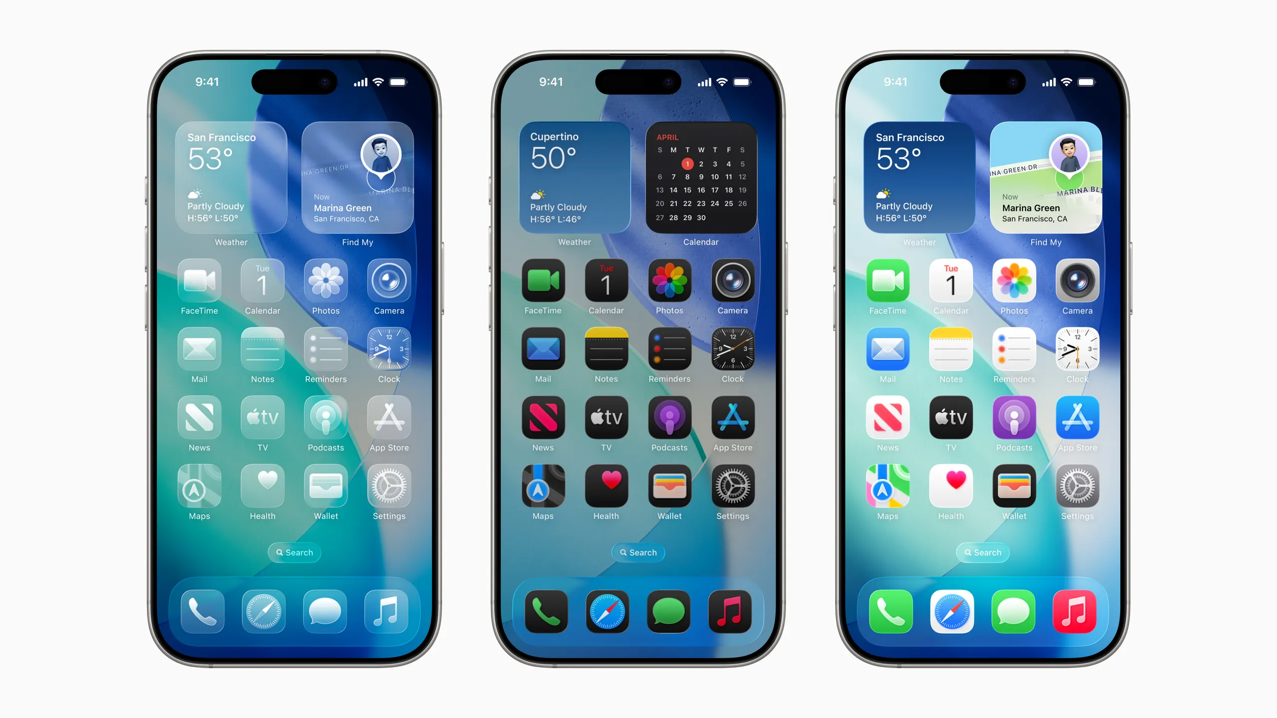
Let me preface this by saying that currently we can’t really judge Liquid Glass objectively, since it’s still in beta and being actively changed with every new developer beta release. Until it is released officially this September, we can’t objectively speculate about Apple’s new design direction.
That said, my personal experience with the betas and the implementation of Liquid Glass on both the iPhone and the Mac has been mostly negative. The heaps of bugs aside, the Liquid Glass aesthetics feel off and out of place on either device I’ve used it so far.
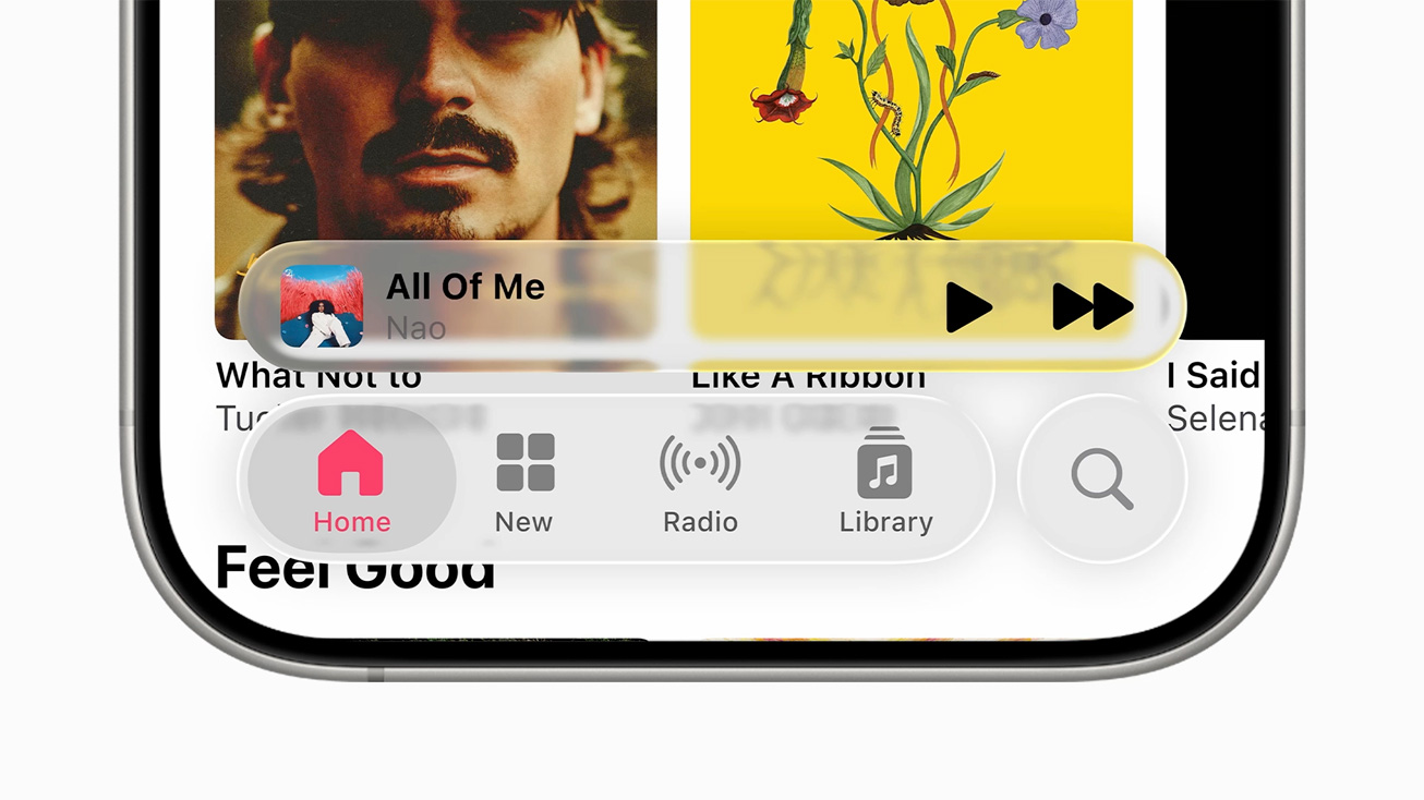
Liquid Glass is an accessibility nightmare
At this point, I don’t feel that Apple will be able to pull off this visual restyle and convince the wider public that it looks better than what the ecosystem has right now. It’s a combination between my dislike for Apple’s own implementation of the glass-like design and my shaken confidence that Cupertino is capable of shipping a coherent and complete product.
Read more:iOS 26 vs Android 16 vs One UI 7-visual comparison
Old thing good
If you’ve been on this planet long enough, you definitely remember the early aughts, which were absolutely dominated by the Frutiger Aero and Windows Vista Aero Glass style language. Windows 7, which is arguably the best Windows version Microsoft has ever released (fine, Windows 10 is at least on par), also heavily leaned into the glass-like style, and it really clicked.
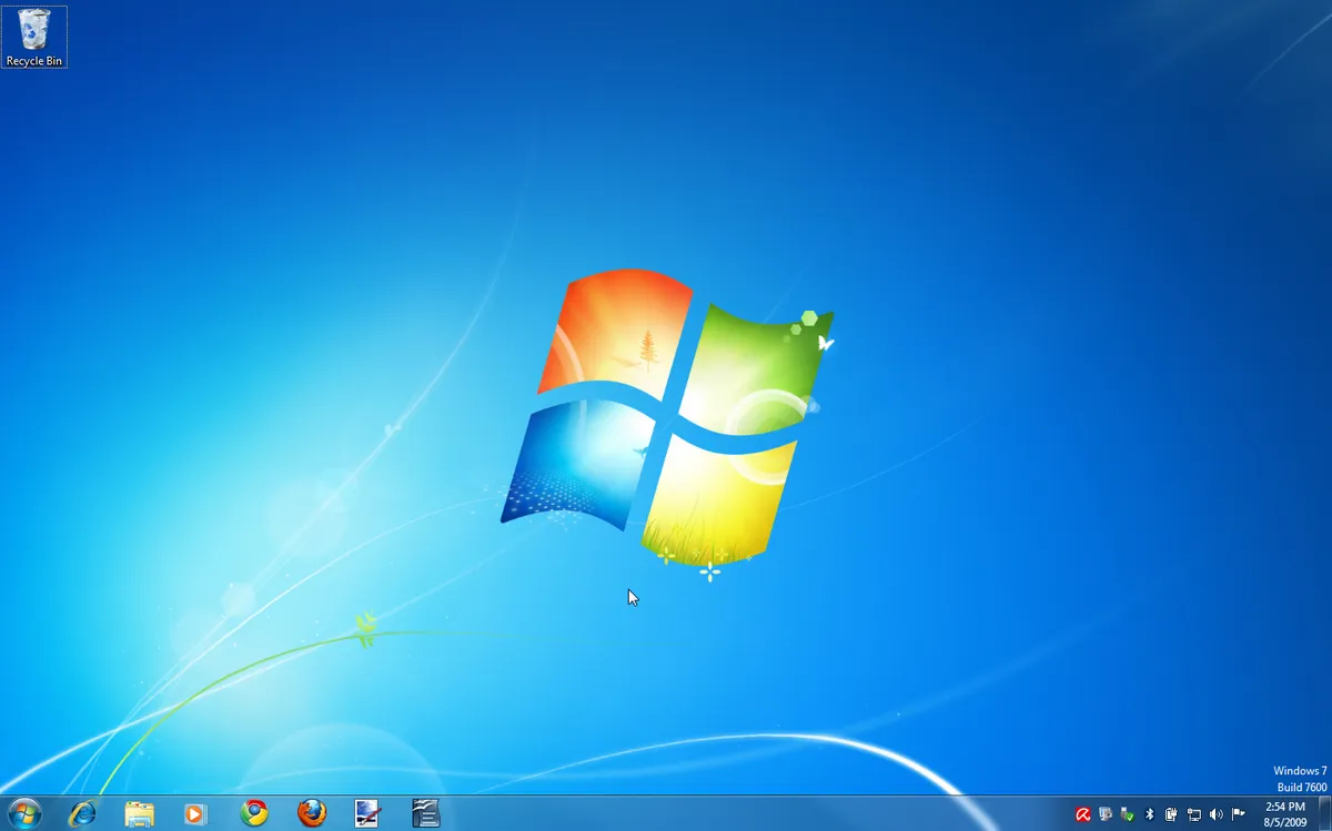
Don’t know about you, but this Windows 7 screenshot fills me with a warm nostalgia
True, many of you remember that Windows Vista was received rather poorly back when it was released. The problem wasn’t the aesthetics, but the outrageous at the time hardware requirements to run the beautiful Microsoft OS, which gave it a bad name and tarnished its public image.
But wait, we can go deeper.
In January 2000, at the turn of the millennium, Apple introduced the bold new and modern look for Mac OS X 10.0, called Aqua. This design language evolved over the years and was used until Mac OS X Tiger, but fell from grace with 2007’s Leopard release.
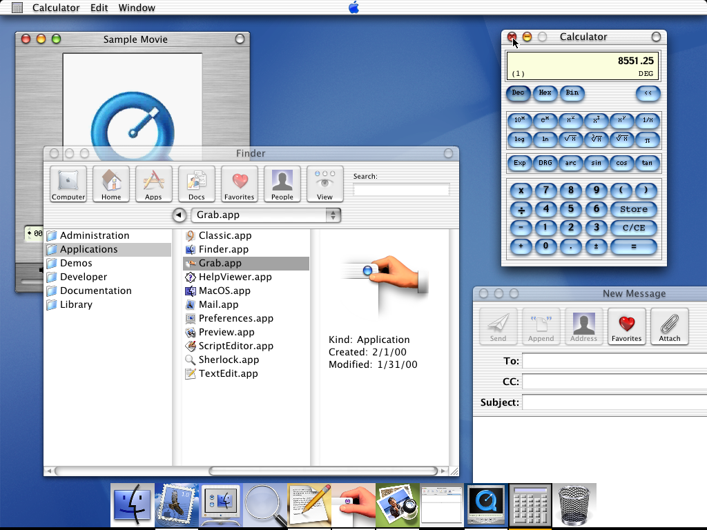
Yep, a rather glass-like interface if you ask me, and it came nearly 25 years ago
It’s a closed cycle of ideas, really, and this generation’s Aqua is called Liquid Glass.
Liquid Glass: Adoption en masse?
See that? Get used to this look because it’s going to be everywhere
Not eager to point fingers here, but you can probably guess which manufacturers could be among the first to get inspired by the Liquid Glass aesthetics. I have a bunch I can name on the top of my head, and I have the feeling we’re thinking about the same ones.
Initially, I bet we’d see the design language creep through the lock screen notifications shade, or the quick settings menu. Then, someone would emulate the glass-like, see-through menu navigation elements and buttons.
I hope I am not right and would be happy to be proven wrong in the years to come, but I think we’d quickly start seeing complete 1:1 homages to Liquid Glass on a smartphone or a tablet near us, further bringing brand identity into the gutter.
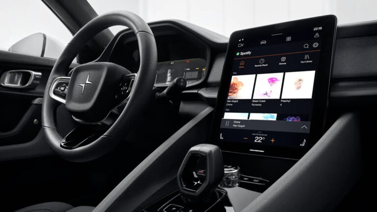
That could be a terrible move for Android, which recently also scored a fancy new redesign. Material 3 Expressive is different, though, as it’s merely a continuation and evolution of the Material Design of old and not such a major rethinking of the overall aesthetics.
Another problem with Material 3 Expressive is that it will only be experienced to the fullest on Google’s own Pixel phones and devices from some manufacturers that don’t really deviate too much from stock Android (think Motorola, Sony, and some others).
I’ve recently bemoaned how one of my favorite phone brands has been slowly losing its identity in an ever-ending quest to copy Apple, and I hope I wouldn’t have to do that for another favorite.