A beloved Pixel feature is getting a small change in a beta release and not everyone approves
If you’re a Pixel fan, you probably enjoy the At a Glance widget located at the top of the Pixel home screen, lock screen, and Always On Display (AOD). The widget delivers timely and useful information. Besides showing the date and current weather conditions, the At a Glance widget will alert users to:
- Air quality readings
- Severe weather alerts
- Earthquake alerts
- Upcoming events including those in your calendar, hotel reservations, and reminders
- Status of delivery and pickup orders
- Shows when a package will be collected or delivered
- Traffic and travel time for your commute
- Recommended departure time to make upcoming event
- Flight, trains, other travel info culled from Gmail
- Fitness info from selected fitness apps
- Safety check countdown from the Personal Safety app
- Timer & stopwatch info from your phone and home devices
- Connection and battery status for Pixel Buds and other connected devices
- Timer information from home devices
- See images from your Nest or Ring doorbell camera
- Shortcut turns on the phone’s flashlight and reminds you when it’s on
The latest beta release of Android 16 QPR1 continues to show the same color-free look for the weather icon in the At a Glance widget. This lessens the possibility that the removal of color from the icon is something Google is just trying during the beta.
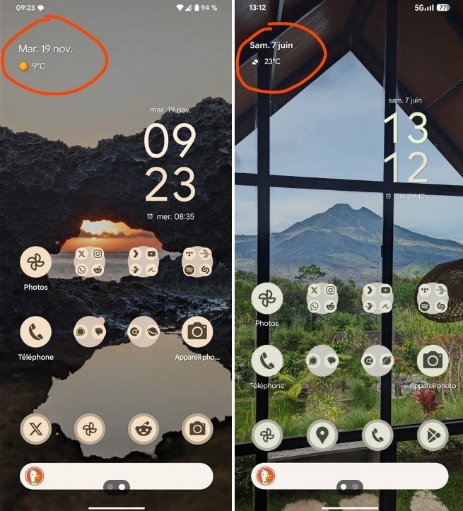
At left, the old look with a yellow sun icon and at right, the new color-free weather icon for the widget. | Image credit-“samhot66
For example, on a sunny day, the sun icon would be yellow. Now, the icon appears in white. The ensuing battle on Reddit shows how important At a Glance is among Pixel users with some happy with the new look (“I actually prefer it without colors. Cleaner. The colored icons we had were pretty ugly”). Others were ready to go marching to Mountain View with pitchforks and torches (“It’s terrible and takes up the whole top of the screen. I’m not a fan”).
Others pitched a solution (“So y’all complained about it taking up too much home screen space so they fixed it and now y’all are complaining it looks ugly? Google legit can’t please you people just buy an iPhone”). Perhaps the most obvious response was the one that suggested Google add a toggle so Pixel users can bring back the color for the icons if they like it better, while those who disapprove can leave the color off.