This iPhone feature is keeping me from switching back to a Pixel
Ryan Haines / Android Authority
I often find myself shuffling between phones — sometimes as frequently as switching handsets every week. And I make sure to replicate my home screen layout on each Android phone so that I don’t feel unfamiliar when switching and my muscle memory doesn’t act up either.
But every single one of those Android phones teases my inner urge to have everything look visually organized. When you have a bunch of widgets — all different shapes and sizes — plastered across multiple home pages, it ends up looking haphazard, no matter how much you try.
I flinch every time I glance at my home screen on Android, and that’s one big reason I dread going back to a Pixel as my primary phone.
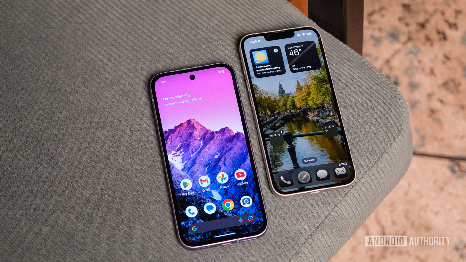
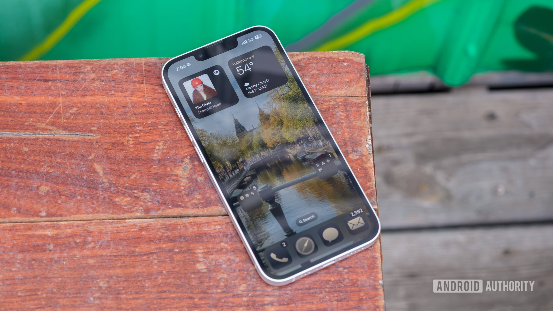
The iPhone is known to be very controlling about how things appear on the screen, even for third-party apps and widgets. And in this case, I honestly think it’s a good thing. My home screen on the iPhone looks far more organized and pleasing to the eye just because of one feature: stacked widgets. With them, I can do a lot more on the same screen size instead of filling up ten home pages to house all my widgets.
Ryan Haines / Android Authority
Yes, I am a widget freak. But more than that, I’m someone who’s a sucker for clean aesthetics — and I flinch every time I glance at my home screen on Android. It’s something you stare at all day long, and that’s one big reason I dread going back to a Pixel as my primary phone — even though Android 16 has me seriously tempted.
Do you want to see stacked widgets on Pixels?
0 votes
Android vs iOS: Stacked widgets edition
Stacked widgets are an ingenious way of saving space — and saving me from having to swipe through endless pages. I check traffic using the Google Maps widget twice a day and run my robot vacuum once in the morning. I do need those shortcuts, but they don’t have to be in my face all the time, right?
On my Pixel, each widget occupies a permanent spot, whether I need it at the moment or not. And the inconsistency is just jarring, with different shapes, sizes, and corner radii that turn the whole screen into visual clutter. My LG AC widget awkwardly sits in a 1×1 slot while another smart home control eats up a 2×2 grid — both doing the same thing. It’s insufferably chaotic, at least to my nit-picking eyes.
In comparison, my home screen setup on the iPhone 16 Pro Max looks cleaner and calming to my nerves. All my smart home products are stacked into a single widget — whether it’s an LG device or a no-name smart plug. I just scroll through the stack to find the one I’m looking for. The same goes for my search stack. I use multiple search and AI tools — Google, Perplexity, and ChatGPT — and I can cycle through them to start an instant search without each one separately hogging screen space.
More importantly, I can turn these into smart stacks — something iPhones have handled well even before AI became a cool buzzword. My phone now surfaces the world clock widget at the same time each day before I call my loved ones halfway across the world, while the stock market widget quietly disappears after the evening frenzy checks during a market crash.
That’s not to say Apple’s implementation is flawless. For instance, I wish Apple would offer a smaller size (say a 2×1 grid, vertically or horizontally), especially for widgets that only need a single tap. But still, there’s so much value in stacked widgets that I didn’t fully grasp until I had them — and now I just want Google to bring its own version to Pixels.
What would Pixels need to do?
Stacked widgets may look simple, but on Android, they’d be a pain to implement, mostly because of fragmentation. Google would need to take up the herculean task of aligning its millions of developers to make widgets in standardized sizes. But even that won’t solve everything, because Android lets you customize grid sizes on your home screen, which complicates things further.
Ryan Haines / Android Authority
Frankly, if Google hasn’t been able to get app developers to adopt themed app icons — with many still stubbornly clinging to their colorful logos — I’m not too confident it can pull off universal widget sizing, at least soon enough.
But there’s still hope. Third-party developers have found workarounds, which makes me believe I’m not the only one frustrated by this gap.
Your current options
When it comes to Android, I am married to Pixel phones for their clean (read: superior) experience and day-one OS updates. So I want stacked widgets on my Pixel by default, without resorting to launchers or UI hacks.
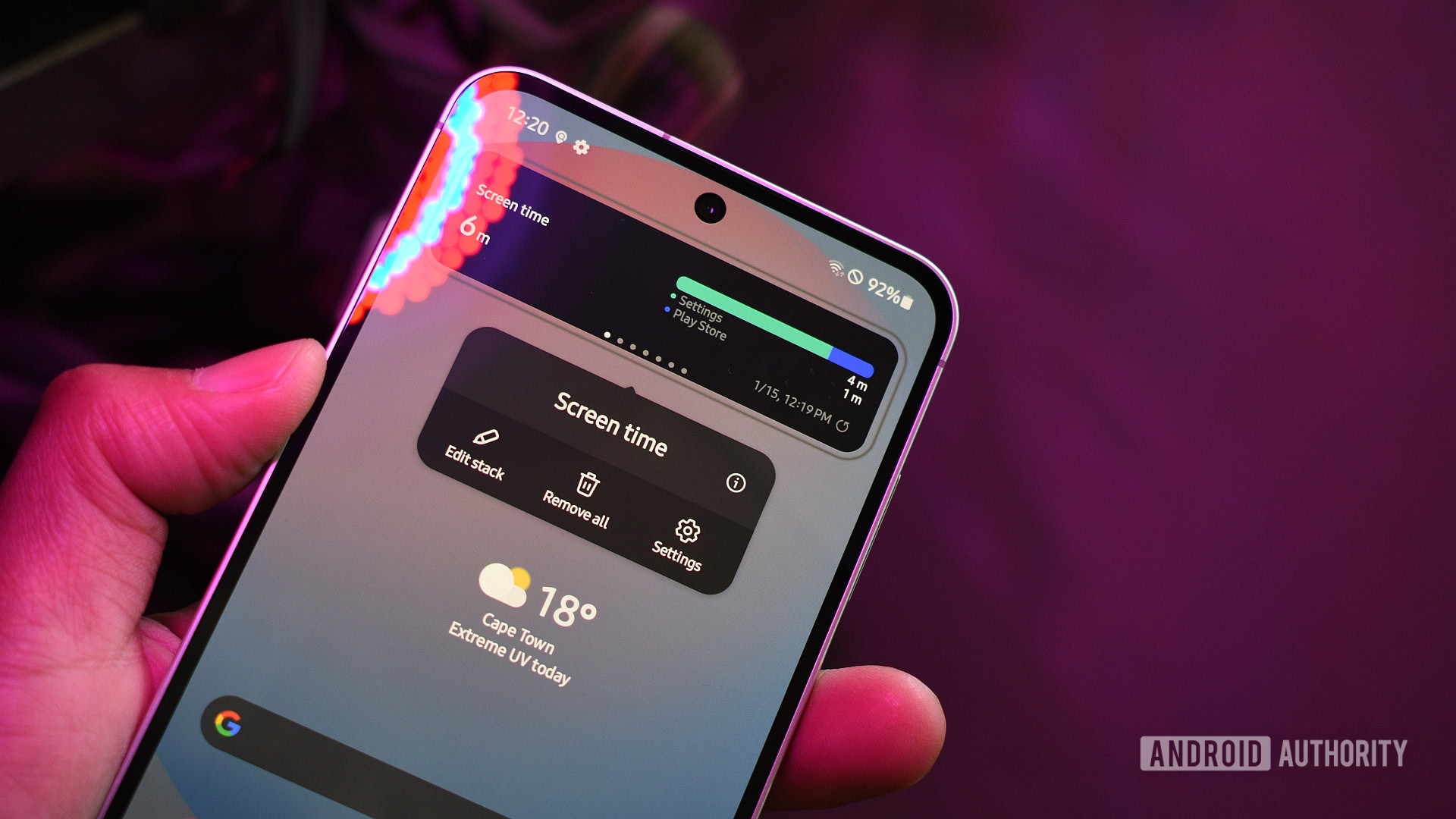
But if you aren’t as stubborn as I am, you’ve got plenty of options. Samsung added native support for stacked widgets a few One UI versions ago — so technically, Android has had this feature for a while now. It’s just the Pixel that’s missing in action.
Andy Walker / Android Authority
And others aren’t entirely out of luck either. You can install third-party launchers like Action, Smart Launcher, or Niagara to get a stacked widget experience that I have been craving on Pixels. Just know that most of these solutions only let you stack similarly sized widgets — or stretch them awkwardly to fit, resulting in zoomed-in content or excessive padding. So these solutions are far from perfect, but they are still better than nothing.
There’s so much value in stacked widgets that I didn’t fully grasp until I had them — and now I just want Google to bring its own version to Pixels.
Until that happens, I’ll keep sighing every time I swipe past the visual mess on my Pixel while quietly enjoying the neat order on my iPhone.


