This small tweak is low-key my most anticipated Android 16 feature
Joe Maring / Android Authority
Android 16 is shaping up to be the biggest visual update to Google’s mobile operating system since the introduction of Material You with Android 12. That release was all about making the experience feel more personal to each user, with dynamic theming that could extract your wallpaper colors and apply them to other parts of the system. There was also a much more playful approach to form and motion across the OS. With its latest design system update, Material 3 Expressive, Google is taking that philosophy one step further, with even bolder colors and shapes, springier animations, and some quirky new typography choices.
While many of the upcoming changes in Android 16 feel somewhat superficial, with little practical significance, there are some small tweaks that I think will make a big difference to the way I interact with my Pixel phone. Chief among them is a seemingly minor update to the quick settings panel that sits atop the notification shade. And it’s something I’ve been yearning for ever since the launch of Android 12 back in 2021.
What’s your most anticipated Android 16 feature?
0 votes
Fixing what Android 12 broke
As far as I’m concerned, Google perfected the quick settings panel as far back as Android 7.1. Easily accessible toggles debuted with Nougat (7.0), where a single swipe down from the top would reveal five quick settings icons in a single row, with the sixth spot being reserved for a down arrow that revealed expanded settings with more information. Google moved the arrow and replaced it with another toggle in the next point release (7.1). We now had six customizable toggles in a single line, leaving plenty of space below for our all-important notifications. Swipe down again and you’d see nine expanded toggles with information about WiFi networks, connected devices, and so on.
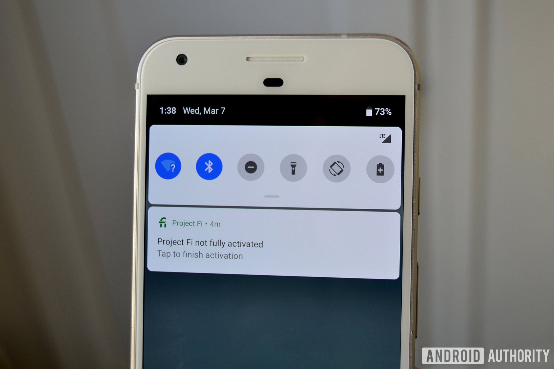
Aside from tweaks to the styling, this remained almost unchanged for the next four Android versions (see Android 9 Pie in the image above). Android 11 irked some users when it reduced the number of expanded quick settings from nine to six (to make room for new media controls). But Android 12 is when the biggest change to this feature arrived, and it’s hard not to see it as a major misstep from Google.
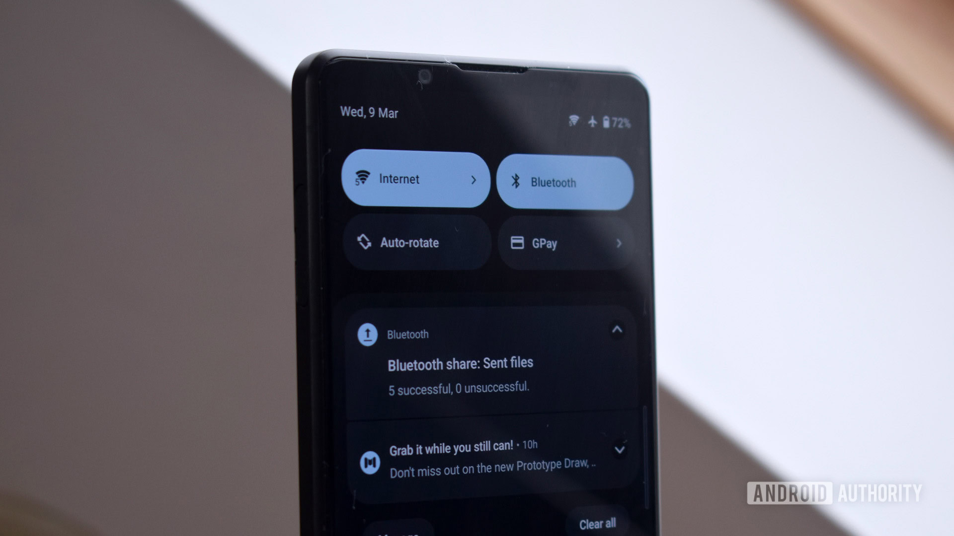
Instead of the 6 quick settings toggles in the notification shade that we’d all gotten used to, we were now greeted by just four extra-wide tiles with text labels. They also took up more vertical space since they were spread across two lines. It seems that Google wanted to make some information more glanceable, such as which Bluetooth device you were connected to. But this wasn’t consistently applied, so you’d have tiles such as ‘Internet’ that only showed your connected network when the quick settings panel was expanded. Other toggles, such as ‘Flashlight’ and ‘Hotspot’, were given unnecessary labels even though their utility was obvious from the icon. The on/off status was still conveyed by the color of the tile, as it had been previously.
Robert Triggs / Android Authority
Like many others, I found this change to be incredibly frustrating. Having access to fewer toggles with a single swipe down was already less convenient, but Google also made changes to how some of these toggles functioned. You could no longer turn WiFi on or off with a single tap — instead, you’d have to open the now combined ‘Internet’ menu and tap again to enable or disable your connection.
Android 12’s large tiles was a misstep Android 16 will fix.
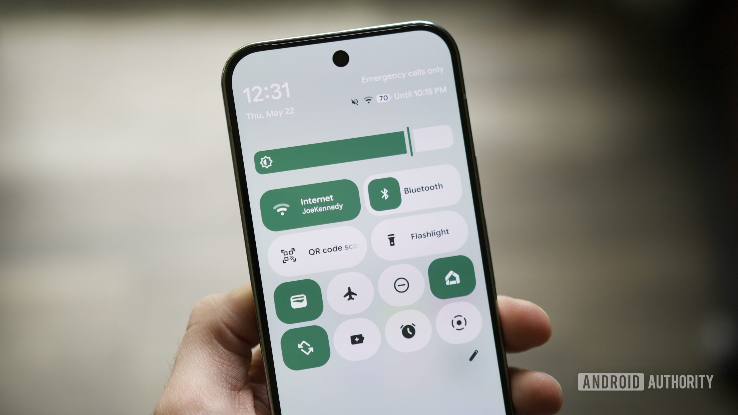
This is how Android’s quick settings have worked for the last four years, at least on a Google Pixel device. Mercifully, Android 16 is set to bring back smaller toggles and give us much more control over the layout of our quick settings. As shown by our own Mishaal Rahman in the video below (an earlier version), it’s going to be possible to edit the size of each quick settings tile. If you don’t mind the larger 1×2 tiles, you can leave them as they are. Those of us who want smaller 1×1 toggles can shrink them accordingly, on a per-toggle basis.
The quick settings panel at the top of the notification shade will still take up two rows, which means we’ll be able to have up to eight toggles within easy reach if we make them all 1×1. The best part of this is the ability to mix and match. I can see myself keeping the wide Bluetooth tile so I can easily glance at my connected devices while making most of the other toggles smaller. The ‘Flashlight’ tile no longer needs to so brazenly announce its presence every time I pull down my quick settings, as if it were begging to be switched on. It can go back to subtly waiting in the wings for that once-in-a-blue-moon occasion when I quickly need to access it.
Adding to my delight, Google is also arranging quick settings tiles in neatly organized categories in the editor view. This will make it easier and faster to find the ones you want to use — yet another user-friendly tweak that I can get behind. All in all, I think these quick settings improvements represent some of the most utilitarian quality-of-life changes I’ve seen in an Android update for quite some time. It’s especially welcome since many of the Material 3 Expressive upgrades seem to be focused more on form than function.
Quick settings improvements are the most utilitarian quality-of-life changes for some time.
The Android platform has always been praised for its personality and customizability, but Google’s Pixel software experience tends to be more rigid than what’s offered by Samsung and other OEMs. Apple has also closed the gap when it comes to personalization in recent years, with the introduction of tinted app icons, lock screen customization, and a more editable Control Center.
So what would otherwise be a fairly minor quick settings tweak represents a big win for the tinkerers out there. With exciting additions such as Live Updates, new motion physics, and bolder UI elements, Android 16 could be Google’s most user-friendly OS yet. And thanks to innovative new wallpaper settings, an intriguing new Pixel themes feature, and the aforementioned quick settings changes, our Pixels are also going to be more customizable than ever before.
