Everything I love and hate about Android’s next big redesign

Joe Maring / Android Authority
If you’ve installed the stable version of Android 16 on your Pixel, you might be disappointed to find that the big visual refresh Google announced on May 13 is conspicuous by its absence. An unfortunate consequence of the new platform release schedule is that some of the more notable new Android 16 features won’t be arriving until the Android 16 QPR1 update in early September. That means that even though there’s plenty of goodness in the initial stable release — like Live Updates and adaptive apps — most people will have to wait a little longer before getting their eyes on the Material 3 Expressive redesign and trying out the nifty new desktop mode.
If you’re happy to run beta software on your daily driver, or you have a spare Pixel lying about, the QPR1 Beta has been available to test since May 20. It includes plenty of redesigned interfaces, fresh animations, updated typography, and new features. I’ve been testing out the beta, which is on its third version at the time of writing with QPR1 Beta 2, and there’s lots to dissect. Some of the changes are most welcome, while some of them have me scratching my head — let’s get into it.
The good
Whenever Google makes substantial changes to Android’s UI, you can bet the notification shade and quick settings panel will be updated in some meaningful way. Android 16 is no exception, and the new quick settings toggles are probably my favourite upgrade in this release.
After being limited to just four wide tiles at the top of the notification shade since the introduction of Material You with Android 12, we’re now treated to editable tiles that can be 1×2 or 1×1. This means it’s possible to fit up to 8 toggles in the same space, and up to 16 if you swipe down again for the full quick settings panel. You can also mix and match single and double-width tiles to your liking.
Andy Walker / Android Authority
As well as more control over the appearance of quick settings toggles, another welcome change is the ability to switch Bluetooth or Do Not Disturb on or off with a single tap. If you use a 1×1 tile for either of these, a quick tap toggles them on/off, while a long press brings up a dialog with more info and settings. If you use the wider 1×2 tile, tapping the icon on the left toggles them on/off, tapping the text opens the dialog, and long pressing anywhere takes you to the full settings page. These now function more like they did before Android 12, which will please lots of users who were sad to see it change.
Moving north from the quick settings panel, we arrive at another sizable departure from the last few versions of Android — the status bar icons have been completely redesigned. This is likely to be divisive, as Google is essentially aping iOS icons here, but I quite like the new style. The WiFi icon now has three separate and very rounded sections. The cell signal icon is now made up of four increasingly tall bars, and the dual-SIM version is split into two horizontally, rather than showing two distinct signal icons for each one. The order of these two icons has also been swapped, iOS-style.

Most controversially, the battery icon is now lying down on its side with the battery percentage displayed inside it (if you’ve got this option turned on). It’s also color-coded — it’s green while charging, red when low, yellow when battery saver is activated, and white when it’s between 21 and 100% and off the charger. I’ll admit that the battery percentage is a little harder to read now as it’s smaller, but other than that, I think the new icons match Android 16’s expressive new look. It’s a shame Google had to copy Apple, though.
One way in which Google is particularly expressing the expressiveness of Material 3 Expressive is with the new motion physics system. The new animations have a spring in their step, with a less-than-subtle overshoot creating a natural, bouncy feeling when you expand a notification group or interact with a quick settings toggle.
This new motion system is also complemented by better use of haptic feedback. If you play around with dismissing a notification, you can see and feel it become unstuck from the others when you swipe it far enough to either side. It’s a subtle change, but one that adds that extra something to make you feel more connected to what’s on the screen.
When Google introduced dynamic color theming with Android 12, a common complaint was that the palettes generated from wallpapers were often too desaturated and pastel colored. This redesign represents something of a course-correction, with a more vibrant set of colors on display across the OS.

The pastels aren’t entirely gone, and since a lot of Google’s core apps have yet to be updated to Material 3 Expressive (which could take a while), it’s not clear how far Google will take it with the new colors. I’m hopeful that the stable version of Android 16 QPR1 will roll out in September with some updated apps and all the bold new color choices Google has teased.
Color is also being applied to more places, such as the new Settings app with its color-coded menu items that allow for quicker navigation. Settings submenus are also easier to parse thanks to more clearly defined subsections inside rounded containers.

Mishaal Rahman / Android Authority
On the subject of settings that are easier to navigate, the Wallpaper and Style app has been rejigged. The home and lock screens are now separated by a swipe, and the clock and color options have been organized into submenus. This simplified experience makes much more sense, and it also draws attention to suggested photos for use with brand-new wallpaper effects.
The Magic Portrait feature frames the subject of the photo within a fun shape on the lockscreen with a colored background and then expands to show the full photo when you unlock and go to the homescreen. It’s perfect for photos of loved ones or pets, and you can customize the shape and color. There are also weather and cinematic effects, but they’re not quite as exciting.

Joe Maring / Android Authority
The bad
Something I noticed almost immediately is that notifications in Android 16 QPR1 feel a little cramped. They take up less space vertically when not expanded, and the spacing between elements is a little tighter. While this does mean more content can fit on screen at once, it does give notifications a little less room to breathe, and I can’t shake the feeling that they seem squished.
There’s also less room for text horizontally because app icons are now larger, and they’re also in full color now rather than the monochrome versions from Android 15. The little caret that you use to expand or minimize alerts is now within a squashed container rather than a circle, and it always sits closer to the top of the notification, whereas before this was centered vertically. On a couple of occasions, this has caused me to accidentally press the cross at the top of the silent notification list, which clears them all instantly. The touch target is already small, and making them closer together has led to this frustrating experience.

Mishaal Rahman / Android Authority
Clearing silent notifications is one thing, but clearing all of them at once is an even more destructive action. This is especially irksome as I like to leave notifications as a reminder to do something later or just until I’m ready to deal with them, as I’m sure many people do. Curiously, Google has made the ‘Clear all’ button much more prominent, increasing my anxiety that I’ll press it in error. I’ve only managed this once so far, but it’s the fear that gets you. If you use the notification history feature, as I do, it’s not the end of the world. But I’d love to be able to remove this button altogether. Failing that, a confirmation step or undo button would do the trick.
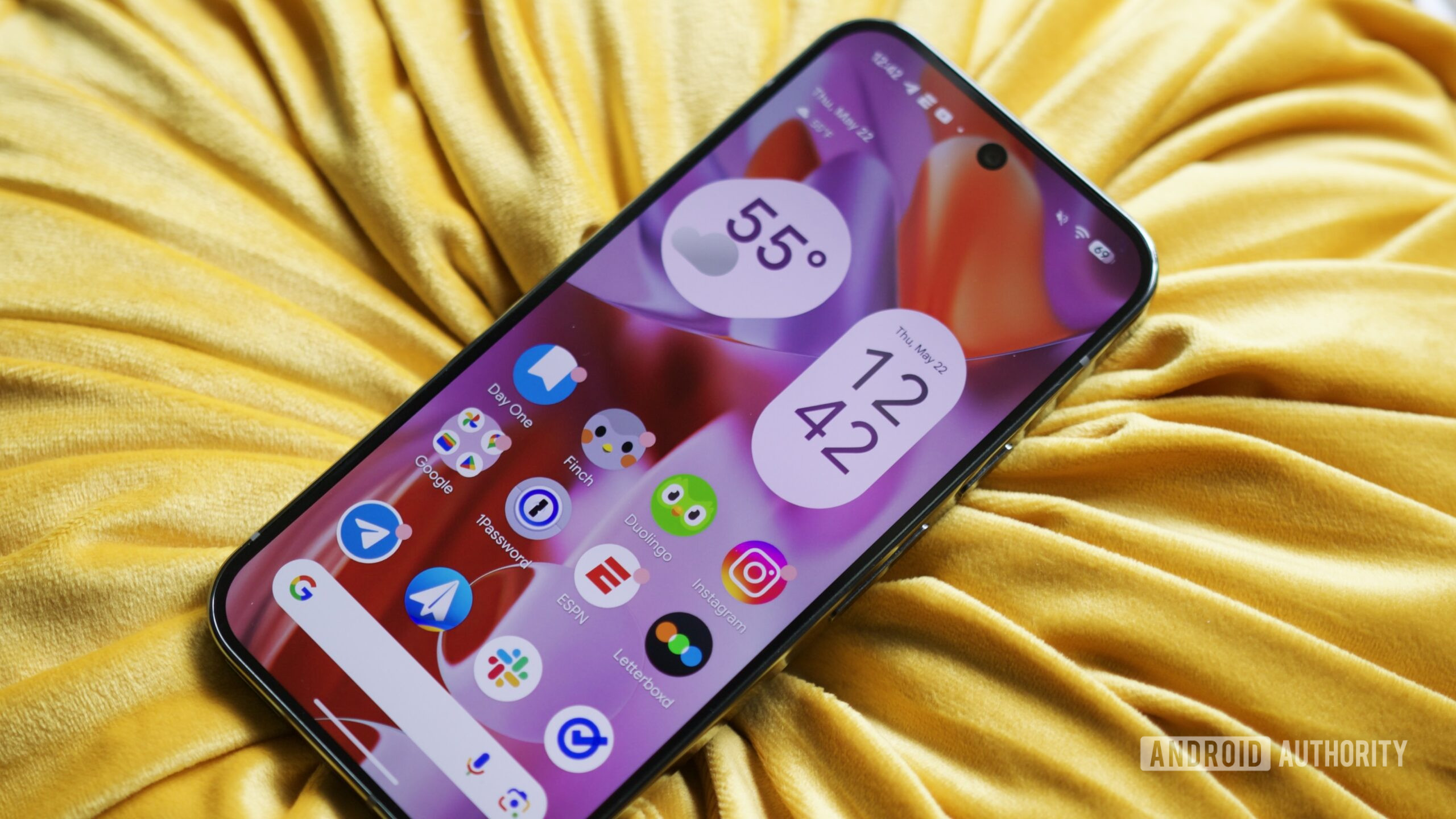
When you first update to QPR1, you’re greeted with a little note on the homescreen explaining that you now have an extra row for app icons. Great, I thought, until I realized that the compulsory At a Glance widget has been made much smaller to create the extra space. I am a fan of the widget, although I still think there should be the option to turn it off if you don’t want it. Keeping it there but making it harder to read is not the solution anyone wanted.

Joe Maring / Android Authority
The most minor of my complaints is the addition of crosses and checks to switches across the OS. This feels like a change for the sake of it, as I think the on/off state of these switches was already plenty clear with the previous versions through color and shape differences. The new Settings app is mostly excellent, but this one element adds visual clutter that I think we could do without.
The ugly
It might be a bit harsh to call the new system font ugly, but I do think it’s a downgrade. It looks to be a new rounded version of Google/Product Sans, and it’s used for the clock, status bar, all across the notifications, quick settings tiles, and lots of places throughout the Settings app. I wouldn’t mind this bubbly new typeface were only used sparingly, like for headings and larger text like the clock. I don’t think it looks great at smaller sizes, and it lends a slightly childish feeling to the OS overall when it’s used this heavily, so I’d love to see Google scale down its use a bit.

My least favorite aspect of Android’s latest redesign, by some margin, is the use of transparency and background blur. You’ll see it behind the notification shade and quick settings, it’s underneath the app drawer, and it’s the backdrop for the overview/recents screen.
From a purely aesthetic point of view, I think it looks very dated, but I also think it’s very distracting from a usability standpoint. How bad it looks depends on your wallpaper or what screen you’re on when a blurred surface is pulled over it. If you’re on a very white/dark screen when you pull down the notification shade, it’s not that bad, but if you’re on a very colorful screen, the blotchy, blurred mess behind the content can be impossible to ignore. The app drawer is the most egregious example, as all the colors of the app icons can clash with your wallpaper, and the app names can be harder to read. I’d also say it looks worse in the daytime, as the effect is more subtle when the dark theme is activated.
Mishaal Rahman / Android Authority
Old vs new app drawer UI in the Pixel Launcher
The contrast issues are nowhere near as glaring as with Apple’s new Liquid Glass design system on iOS 26 and across its other platforms. But it’s still not something I want to see Google copying from its rivals in Cupertino — leave the transparency to Apple and Microsoft. Google has a chance to be the accessibility champion with Android 16, and I’d love to see it differentiate itself by not resorting to blurred backgrounds for core OS features. There’s still time to rectify this before the stable release of QPR1, if you’re listening.
My least favorite aspect of Android’s latest redesign, by some margin, is the use of transparency and background blur.
So those are my takes on the good, bad, and ugly parts of Android’s big redesign coming later this year. If you want to give it a go now, you can install the Android QPR1 Beta on your Pixel, but be warned that you may still run into the occasional bug. Is there anything especially good or bad that I missed? If so, let us know down in the comments.
What do you think of Android’s upcoming redesign?
0 votes