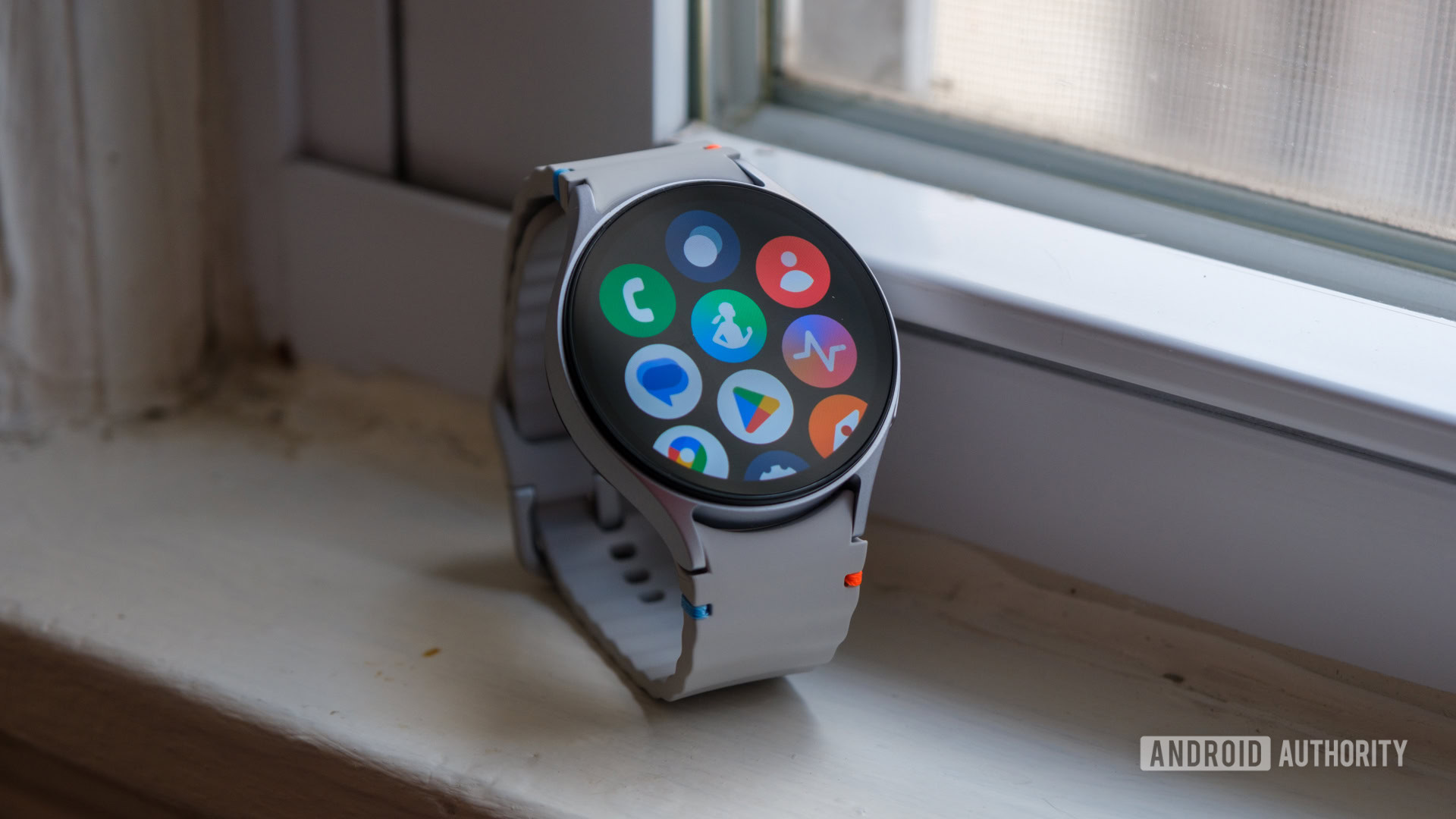
One UI 8 Watch introduces a smarter app layout for Galaxy watches

Ryan Haines / Android Authority
TL;DR
- Samsung has started rolling out the OneUI 8 watch beta for Galaxy Watch 7 and Watch Ultra users in the US.
- • The update adds a Personalized Apps screen that highlights frequently used apps at the top of the Apps screen/app drawer on your Watch.
- Users can also choose a List view of their apps, making app access more intuitive and organized.
Samsung has begun rolling out One UI 8 Watch beta to Galaxy Watch 7 and Galaxy Watch Ultra users in the US. Users who have enrolled in the beta program are getting the update delivered to their watch, and through them, we are getting our first glimpse of what’s coming next to Samsung’s smartwatches. One of the bigger and most noticeable changes with the update is the Personalized Apps Screen, which now displays your most frequently used watch apps if you want it to.
The One UI 8 Watch changelog mentions this change:
- Personalized Apps screen: Features apps now appear at the top of your Apps screen to give you quick access to the apps you need the most. Apps will be featured based on how often you use them and other usage patterns. You can also view your apps as a list with names instead of only icons.
Telegram user Dalgeishgx shared what this change looks like on their end, and you can see it compared to the current One UI 7 Watch (first screenshot) firmware settings:
In the second screenshot, you can see the new “Show featured apps based on usage” toggle, which will change the Featured apps to your frequently used apps.
Further, the third screenshot shows the View option, which can now be changed into List view to give us a list of apps once you cross over the Featured apps. This should make accessing apps easier for users who found the icons difficult to follow, as the List view appears to be alphabetically sorted.
All in all, most users will likely appreciate these changes as they put your most frequently used apps right at your fingertips. It should also sort the mess of icons that appear in the Grid view — I found them confusing too when I first used a Galaxy Watch 4, and I could have certainly used the List view more at the time.